This time the client was me: redesigning InkPoke
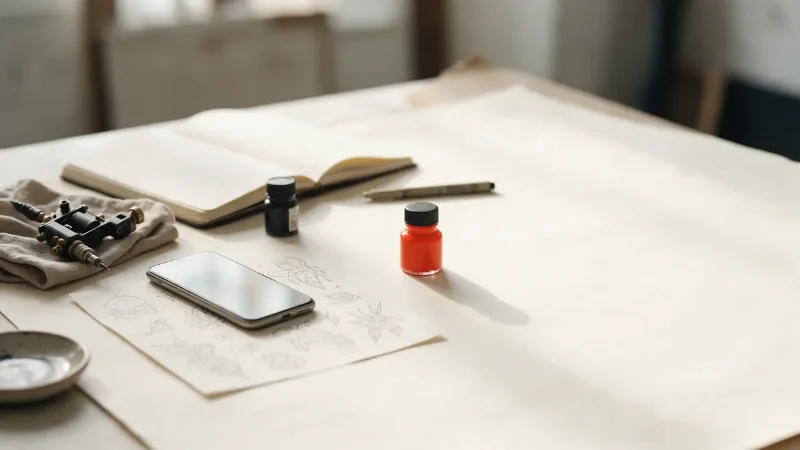
Most notes on this blog come from client projects. This one doesn't. InkPoke is a product I build and run myself: a booking tool for tattoo artists. Each artist gets a public page with their work and their services. Clients send a booking request from it, the artist approves or declines, and when the session needs a deposit, it is paid through Stripe. The whole thing works in 33 languages.
This week InkPoke got a new design. The tour for the artists who use it, every screen before and after, is on the InkPoke blog. This note is the other side: why it changed, the rules that decided each screen, and the part of a redesign nobody sees.
Nothing was broken
The old InkPoke worked. It just looked like most software: dark panels, purple buttons, cards inside cards. For people who spend their day making slow, careful marks, the tool that runs their bookings looked like a spreadsheet.
A redesign that only changes the colours is a coat of paint. This one follows a few rules, and every screen had to obey them:
- paper and ink: a warm paper background in light mode, deep ink in dark mode, following the phone's own setting;
- one red button per screen, and it is always the next thing to do;
- on the public page, the artist's work comes before anything else;
- thin rules instead of boxes inside boxes.
The second rule did most of the work. When only one thing on a screen can be red, you have to decide, screen by screen, what the next action really is. That decision is the design. The colour only shows it.
The screen that matters opens first
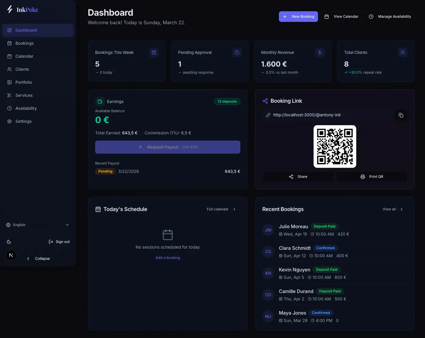
The old home screen opened on four statistic cards, an earnings panel and a QR code. Booking requests, the one thing waiting for the artist, came further down, and on a phone, well below the fold. The new home screen is called Today, and it opens on the requests that need an answer, with Approve and Decline on each one.
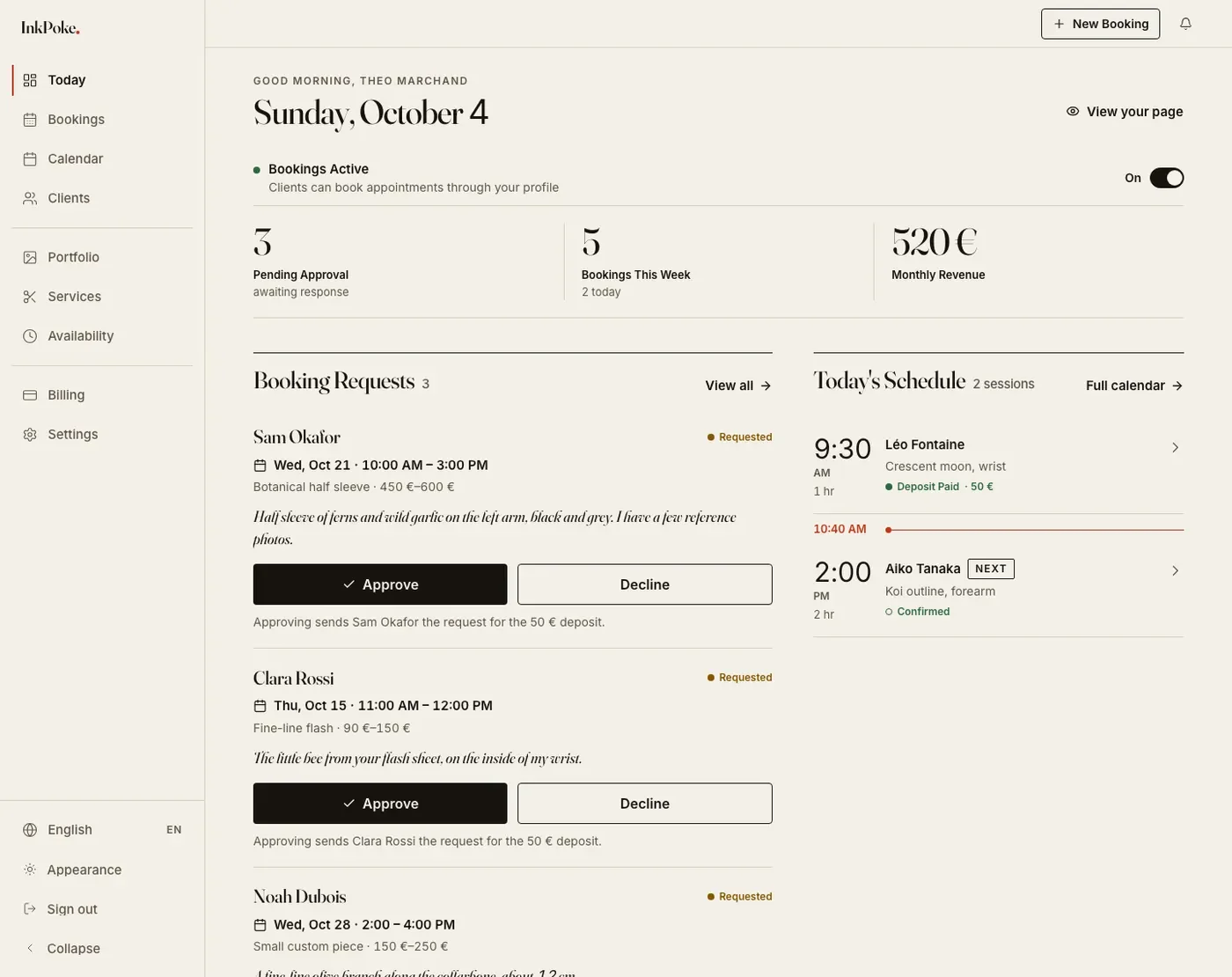
Under each request, one short line says what approving will do: the client will be asked for a deposit, or no deposit is needed. That line matters more than anything else on the screen. Approving can send someone a payment request, and nobody should press a button that moves money without knowing it.
Approve is solid ink, Decline is an outline. Red stays out of it on purpose: it already means "the next step", and a colour that means two things ends up meaning nothing.
Colour is not a status
Booking statuses used to be coloured chips, with a legend to decode them. Each status is now a word with its own dot shape. A confirmed session and a paid deposit stay easy to tell apart in dark mode, on a small screen, and for anyone who doesn't see colours the way the designer does.
Four steps instead of five
Booking used to take five steps. It now takes four: service, date and time, details, review. The date and the time are picked on the same screen. Clients always see who they are booking with, and the page says plainly that a request costs nothing until the artist confirms it.
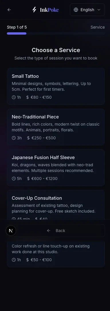
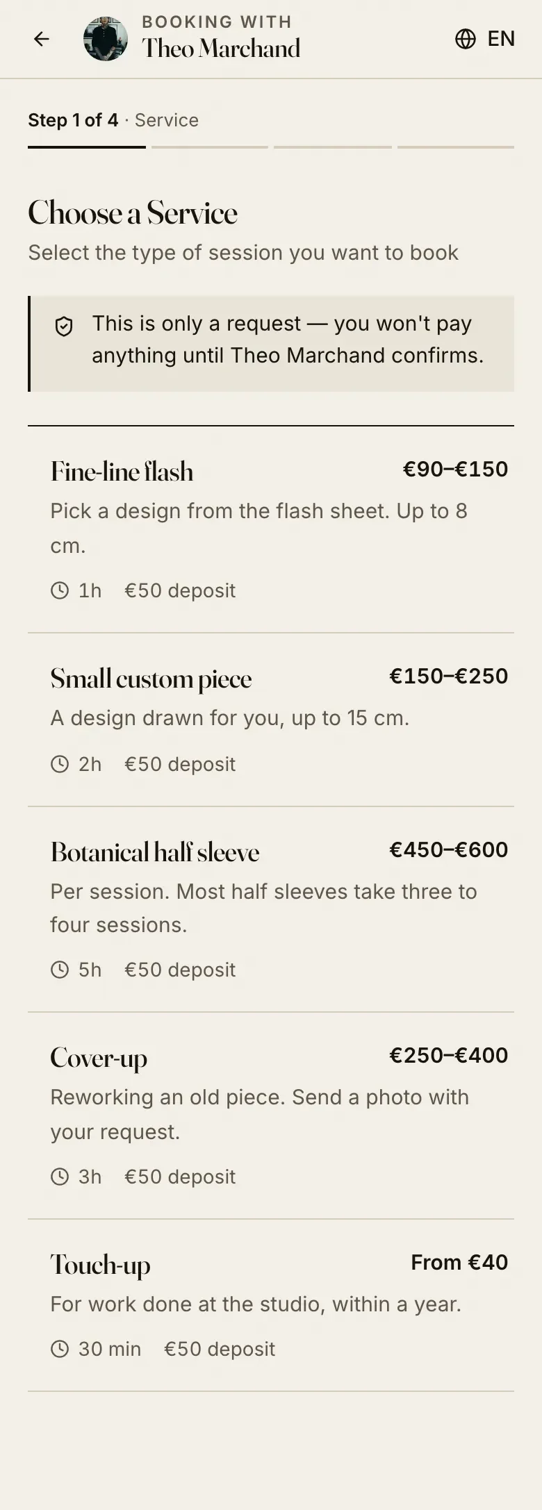
Every step in a booking flow is a place where someone can stop and close the tab. Removing one is not a cosmetic change.
What clients see first
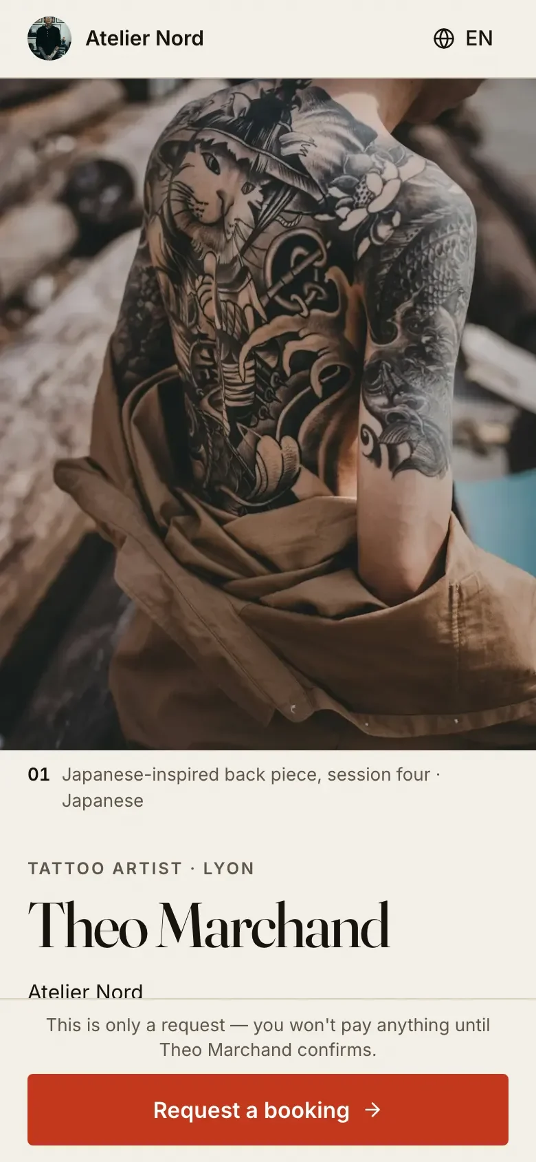
The public page is the one strangers open. On a phone, it now starts with the artist's cover piece, then their name, their studio and their services laid out like a rate card. The gallery shows seven pieces and a link to the rest, so the page stays quick to scroll, and the booking button stays within reach at the bottom of the screen. It also loads about a fifth less code than before.
33 languages, two of them right to left
A redesign in one language is one redesign. In 33 languages it is 33, unless the layout is built for it. Every screen, from the dashboard to the public page and the booking flow, exists in all the languages InkPoke supports, in light and in dark mode. Times follow each language's format, and the calendar runs right to left in Arabic and Hebrew.
That only holds if no text sits in a box sized for English, and if left and right are never hard-coded. This site follows the same rule in its five languages: the layout has to survive the longest translation, not the shortest.
What did not move
A redesign that moves people's data, changes their link or surprises them with a new price is not a redesign anymore. It is a migration, and it needs a plan of its own. So the new look came with a short list of what had to stay exactly as it was: every artist's link, clients, bookings and portfolio, the plans and prices, and the way deposits work. There was nothing to install either. The new design was simply there the next time they opened it.
Why it's on this blog
Because the same rules hold for any tool a business depends on. The next action comes first. Anything that moves money says so before it happens. Colour is never the only signal. And whatever people rely on stays exactly where they left it.
If you run a booking or payment flow that has grown a step too many, or a tool your customers depend on that needs a new face without losing anything on the way, tell me about it. And if you know a tattoo artist, send them to InkPoke.